Introduction
The reason for this post is to highlight the steps I took to add dark theme support and why I took certain decisions. Your mileage will vary so see it as a guide and not the gospel. The starter kit used to bootstrap this site already made a few decisions which I wouldn’t want to change like SCSS which is pretty great. With a CSS-In-Js library like styled-components or emotion, few things would have been easier.
Objectives
- I should be able to share functionality across all components with React hooks
- I should be able to use both Sass and CSS variables together
- I should be able to use either of Sass variables or CSS variables
- User preferred mode should be remembered
- The transition between modes should be smooth
Use React Hooks for the sharable logics
I needed a shared logic for the ToggleSwitch component. One important reason is that the toggle switch will be used ~3 places and it’s a lot cleaner using React hooks for this. The inspiration was gotten from switching off the lights adding dark mode to your react app with context and hooks
import React, { useState, useEffect, useContext } from 'react';

const ThemeContext = React.createContext({
  isDark: false,
  toggleTheme: () => {},
});

// Can only be used within the ThemeContext provider
const useTheme = () => {
  const context = useContext(ThemeContext);
  if (!context) {
    throw new Error('useTheme must be used within ThemeProvider');
  }
  return context;
};

// A custom hook to add ".dark" class to the the body
//  element if the persisted mode on localStorage is dark.
const useDarkThemeEffect = () => {
  const [themeState, setThemeState] = useState({
    isDark: false,
    hasThemeLoaded: false,
  });

  useEffect(() => {
    const lsDark = localStorage.getItem('isDark') === 'true';
    if (lsDark) {
      document.querySelector('body').classList.add('dark');
    }
    setThemeState({
      ...themeState,
      isDark: lsDark,
      hasThemeLoaded: true,
    });
  }, []);

  return { themeState, setThemeState };
};

const ThemeProvider = ({ children }) => {
  const { themeState, setThemeState } = useDarkThemeEffect();

  // Render <div /> if the mode is not loaded yet
  // to avoid rendering in light mode by default
  if (!themeState.hasThemeLoaded) return <div />;

  // Add or remove ".dark" class from the body element
  // when a user toggles the switch
  const toggleTheme = () => {
    const isDark = !themeState.isDark;
    localStorage.setItem('isDark', JSON.stringify(isDark));
    const bodyEl = document.querySelector('body');
    isDark ? bodyEl.classList.add('dark') : bodyEl.classList.remove('dark');
    setThemeState({ ...themeState, isDark });
  };

  return (
    <ThemeContext.Provider
      value={{
        isDark: themeState.isDark,
        toggleTheme,
      }}
    >
      {children}
    </ThemeContext.Provider>
  );
};

export { ThemeProvider, useTheme };
I’m basically using createContext and useContext to provide access to isDark and toggleTheme function. I just need to wrap the Layout component with the context provider. Then, with useContext I can access isDark and toggleTheme on every child component. This is pretty much the same way you’d use Provider and Connect functions in redux. Also, I’m adding dark CSS class if the mode is dark and also persisting user mode to the localStorage. Finally, we export ThemeProvider and useTheme.
Here’s how it’s used in the layout component
<ThemeProvider>
  <div className={styles['layout']}>/* Rest of the code */</div>
</ThemeProvider>
We can now access isDark and toggleTheme anywhere with useTheme.
...
import Share from 'components/Share';
import { useTheme } from 'utils/hooks';
import Comments from './Comments';
....

const Post = ({
  url, post, editLink, timeToRead, twitterHandle
}) => {
  const { tags, title, date } = post.frontmatter;
  const { isDark, toggleTheme } = useTheme();

  const { html } = post;
  const { tagSlugs } = post.fields;
  return (
    <div className={styles['post']}>
      <Link className={styles['post__home-button']} to="/">
        <span>All Posts</span>
      </Link>
      <ToggleSwitch isDark={isDark} onChange={toggleTheme} />
      ....
      ....
    </div>
  );
};
Add ToggleSwitch component
Next up is to create a simple and beautiful ToggleSwitch component.
import React from 'react';
import styles from './ToggleSwitch.module.scss';

const ToggleSwitch = ({ isDark, onChange }) => (
  <div className={styles['switch']}>
    <input
      type="checkbox"
      id="switch"
      checked={isDark}
      onChange={onChange}
      aria-label="Switch between Dark and Light mode"
    />
    <label htmlFor="switch">
      <span>🌙</span>
      <span>☀️</span>
    </label>
  </div>
);

export default ToggleSwitch;
Combine CSS variables and Sass variables
Sass variables were already used in the starter kit I bootstrapped the project from. Like I mentioned in the first paragraph, things would have been a little easier with styled-components, emotion or any of the CSS-in-JS library. However, I don’t want to change the current structure.
First up, I created a sass map of the existing colors to help me convert them to css variables and ensure that nothing depending on them breaks.
$colors: (
  base: #141618,
  primary: #206aff,
  secondary: #b15e09,
  bg: rgb(250, 250, 250),
  whitish: #ffffff /* Funny name though 😅 */
);

$colors-dark: (
  base: map-get($colors, whitish),
  primary: map-get($colors, secondary),
  secondary: map-get($colors, primary),
  bg: map-get($colors, base),
  whitish: map-get($colors, base)
);
color-dark map simply inverts the colors. I’m using sass map-get to access the values specified in the map.
/* Sample usage */
.subscribe {
  color: map-get($colors, whitish); -> #ffffff
}
Convert Sass color map to CSS variables
To achieve the goal of inverting between two color maps, I leveraged the root css pseudo class inside _generic.scss file.
/* For light mode */
:root {
  @each $name, $color in $colors {
    --color-#{$name}: #{$color};
  }
}

/* For dark mode */
body.dark {
  @each $name, $color in $colors-dark {
    --color-#{$name}: #{$color};
  }
}
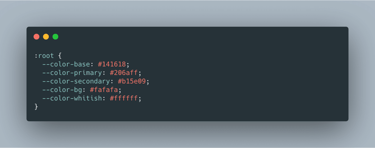
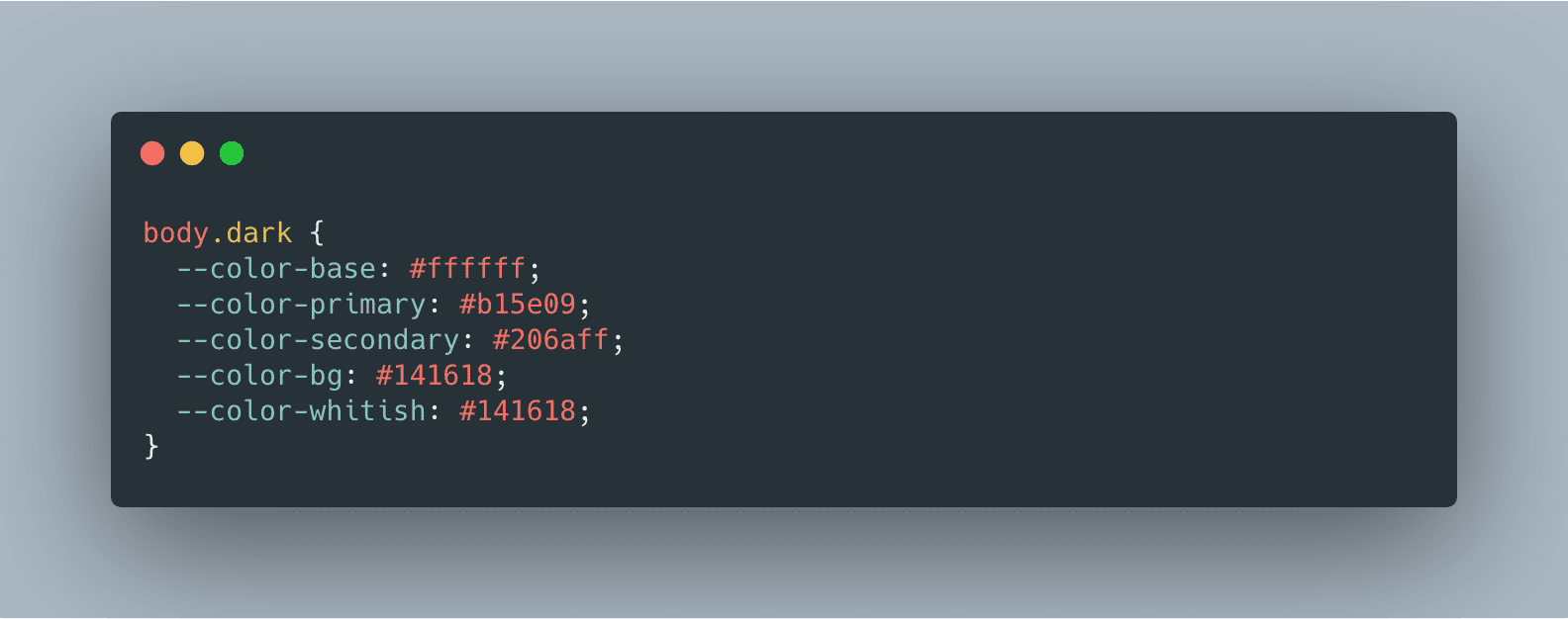
This will transpile to:


Create a Sass function for easy accessibility
In order to easily use the CSS variables with the existing styles, I created a sass function which takes the color name and returns a CSS variable.
@function getColor($color-name) {
  @return var(--color-#{$color-name});
}
Sample usage looks like this
@import 'path/to/functions.scss';
/* Switch between "#206aff" and "#b15e09" */
color: getColor(primary);

/* Switch between "#141618" and "#ffffff" */
border: 1px solid getColor(base);
Where not to use CSS variables
I wanted to have control over which section of the UI is updated with the toggle and which part remains constant. For instance, Subscribe to Newsletter form, code blocks, scroll to top button, Footer, etc should remain as-is. In those cases, I accessed the color from the map instead of using the values set in the CSS variables.
/* Subscribe form */
.subscribe {
  /*
    The color and background remains constant
    when you change mode
  */
  color: map-get($colors, whitish);
  max-width: 350px;
  background: map-get($colors, primary);

  ....
  ....
Color updates not syncing properly
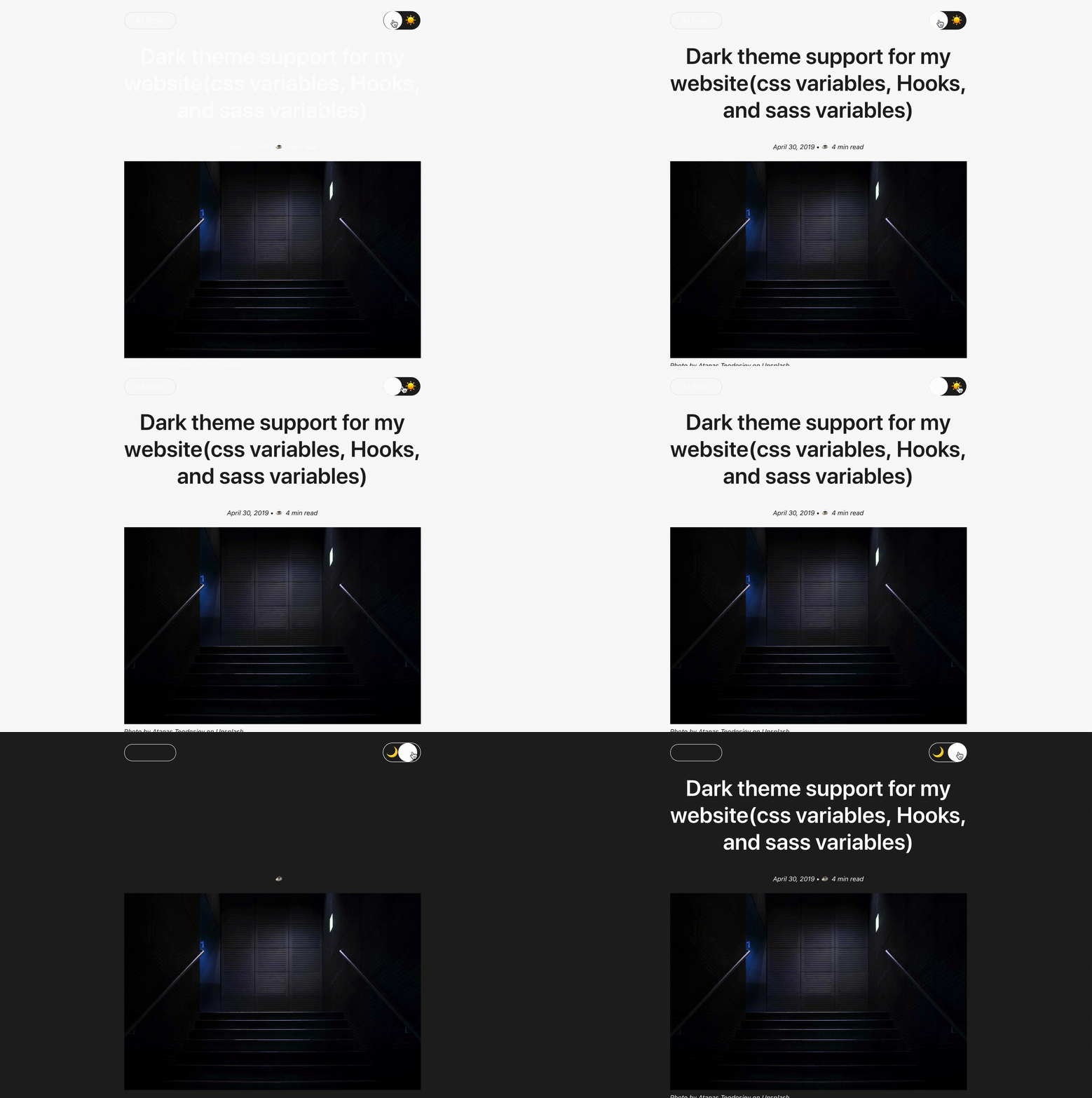
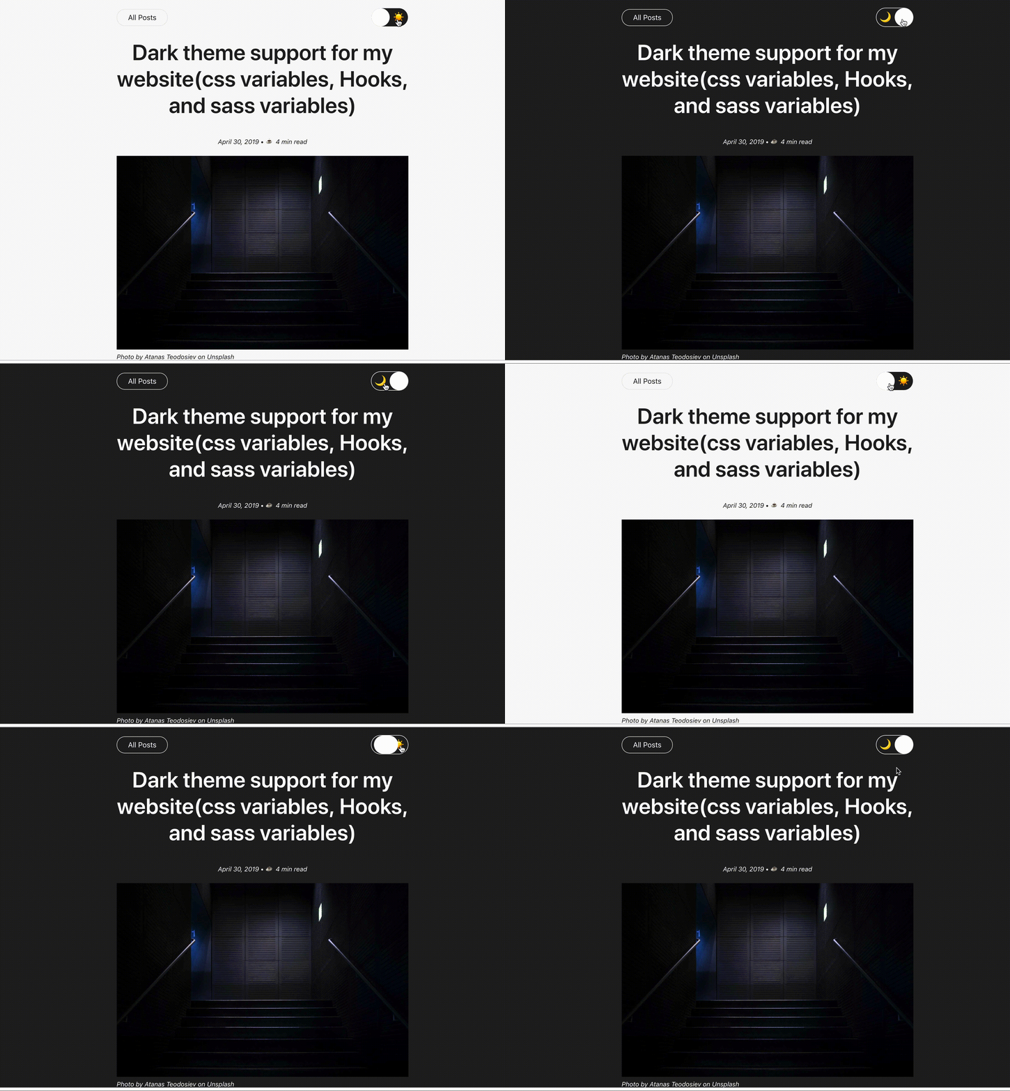
The color of some sections of the page content was updating faster than others. This is obviously a bad UX as different sections update differently. A workaround was adding color to the content wrapper CSS class - content.
.content {
  max-width: $layout-post-single-width;
  padding: 0 15px;
  margin: 0 auto;
  color: getColor(base);
  ..... .....;
}| Before Fix | After Fix |
|---|---|
 |  |
Dark mode coming to CSS!
With the introduction of dark mode in macOS, Safari Technology Preview 68 has released a new feature called prefers-color-scheme which lets us detect whether the user has dark mode enabled with a media query.
Mark Otto described how we can start using prefers-color-scheme today in order to create themes that dynamically adjust to the new user setting.
:root {
  @each $name, $color in $colors {
    --color-#{$name}: #{$color};
  }
}
@media (prefers-color-scheme: dark) {
  :root {
    @each $name, $color in $colors-dark {
      --color-#{$name}: #{$color};
    }
  }
}
Conclusion
There’s an obviously good reason to add dark mode support to the modern day applications. However, such support might be daunting for a legacy codebase. I hope you were able to pick up a few ideas from this article and the lessons learnt.